Neutral Palettes Don’t Have to Be Boring
When people hear “neutral interiors,” they often picture beige walls, bland furniture, and lifeless rooms. But neutrals aren’t about playing it safe—they’re about creating a timeless foundation that lets texture, light, and personality shine. A neutral palette can be warm, dramatic, layered, and deeply expressive when done well.
Think in Tones, Not Colors
Neutral doesn’t mean one shade of beige. It means a spectrum of tones: warm taupes, soft greiges, creamy ivories, sandy whites, charcoal grays, and earthy clays. By layering multiple tones in the same space, you create visual depth without overwhelming the eye.
Design tip:
Pair warm and cool neutrals together — like a warm linen sofa with cool gray stone flooring— to create subtle contrast and balance.
Use Light as a Design Element
Natural light transforms neutrals. Soft whites glow in daylight, warm beiges deepen at sunset, and grays shift throughout the day. Layered lighting—pendants, sconces, floor lamps, and candles—adds warmth and mood after dark.
Lighting isn’t just functional in neutral spaces; it’s emotional.
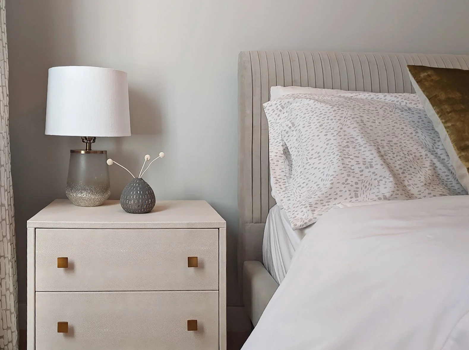
Texture Is the New Color
If color is minimal, texture becomes the star. Think boucle sofas, raw wood grains, plaster walls, woven rugs, ribbed ceramics, linen curtains, and stone countertops. Texture adds dimension and tactile interest, making neutral rooms feel rich rather than flat.
Neutral textures
Layered neutral textures with stone, fabric, and soft finishes create depth.
A neutral room with five textures will always feel more alive than a colorful room with none.
Let Shapes and Forms Speak
In neutral interiors, silhouettes matter. Curved sofas, sculptural chairs, arched doorways, organic tables, and asymmetrical decor pieces become visual focal points. When color is quiet, form becomes powerful.
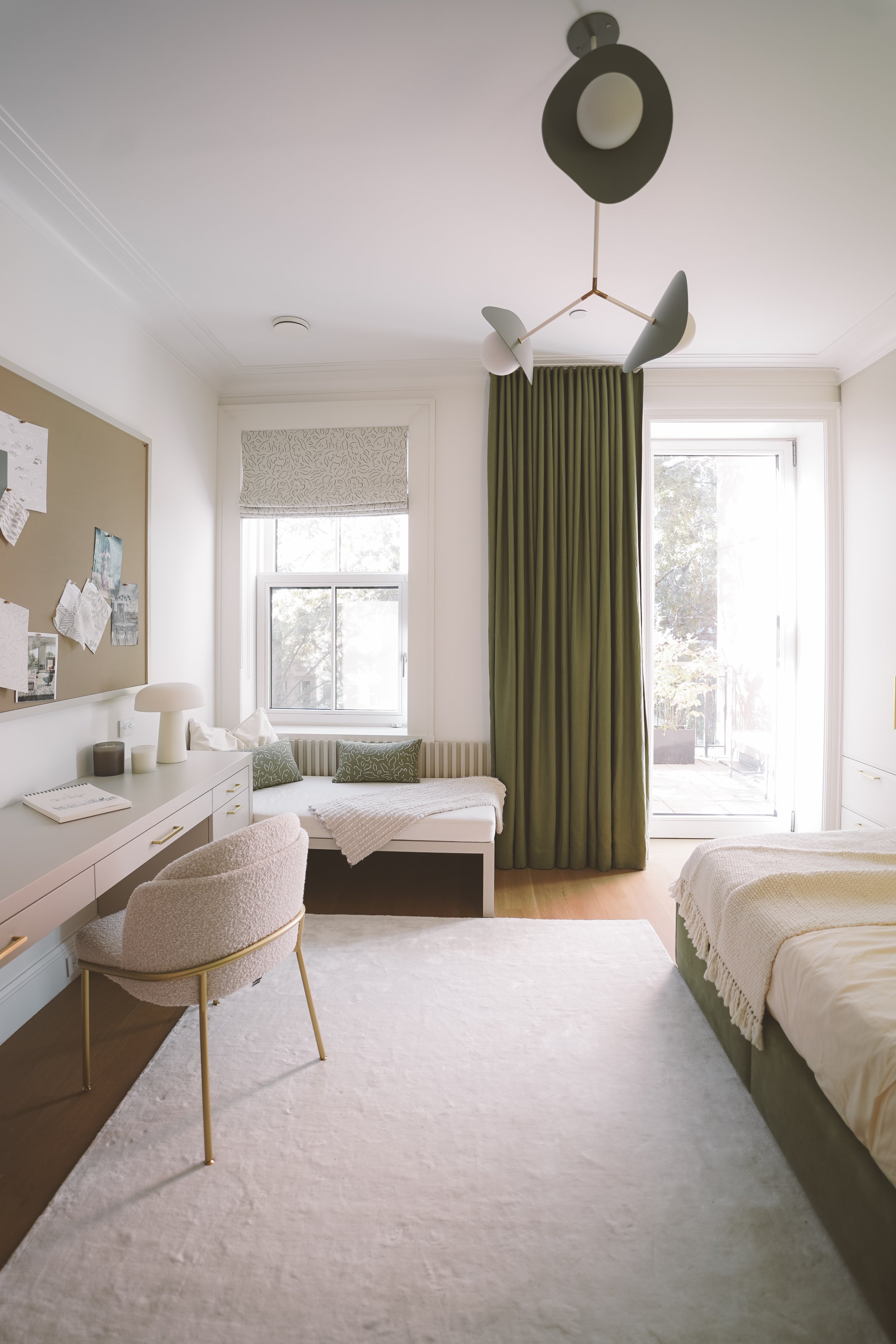
Simple Shape, Strong Form
Curved lighting and streamlined furniture emphasize form, proportion, and modern geometry.
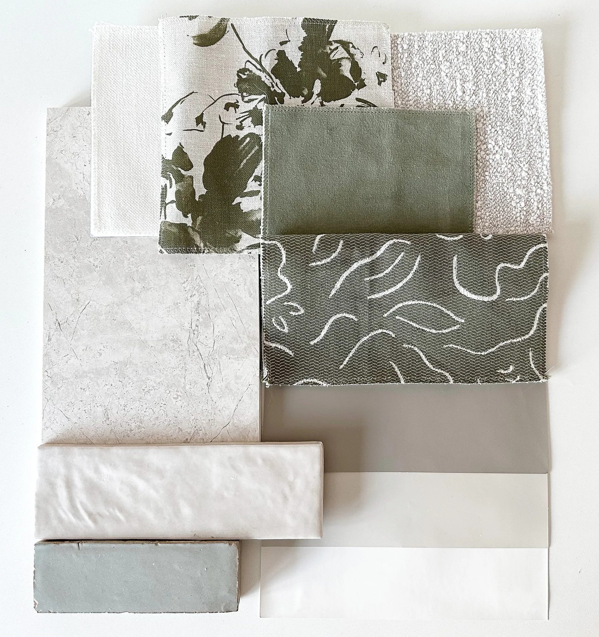
Add Contrast with Materials, Not Color
Contrast doesn’t require bold colors. Mix matte with gloss, soft with hard, smooth with rough:
Marble + wood
Linen + leather
Concrete + wool
Glass + stone

Natural Contrast
Elevate a neutral color palette with wood and metal accents to bring in texture and contrast.
This creates dynamic tension while keeping the palette calm and cohesive.
Personal Touches Make It Feel Alive
Neutral doesn’t mean sterile. Art, books, plants, ceramics, travel objects, and vintage finds inject personality. These elements tell a story—and stories are what make a space feel like home.
Timeless, Not Trendless
Neutrals are timeless, but that doesn’t mean they’re boring. They evolve with styling, seasons, and personal taste. A neutral foundation allows you to refresh your space easily—swap pillows, throws, art, or accessories and the room transforms.